


Choosing the perfect color palette is one of the most important decisions in interior design. Colors influence mood, perception of space, lighting balance, and overall atmosphere. The right palette can make a small room feel spacious, create warmth in large areas, and establish a consistent design theme throughout your home.
In this guide, you will learn how to select a balanced and sophisticated color palette that enhances comfort, elegance, and functionality.
Understand the Psychology of Colors
Before selecting paint samples, it is essential to understand how colors affect emotions and behavior.
- Blue promotes calmness and relaxation.
- Green represents balance and freshness.
- Beige and neutrals create warmth and stability.
- Gray adds modern sophistication.
- White enhances brightness and openness.
- Dark tones like navy or charcoal add depth and drama.
When designing home interiors, choose colors that align with the purpose of each room. Bedrooms benefit from calming tones, while living rooms may require warm and welcoming shades.
Start with a Base Neutral
Most successful interior color schemes begin with a neutral base. Neutral colors such as white, cream, soft gray, or beige provide flexibility and timeless appeal.
A neutral foundation allows you to:
- Add accent colors easily.
- Change décor without repainting.
- Maintain visual harmony across rooms.
Neutrals create a sophisticated backdrop that prevents the space from feeling overwhelming.
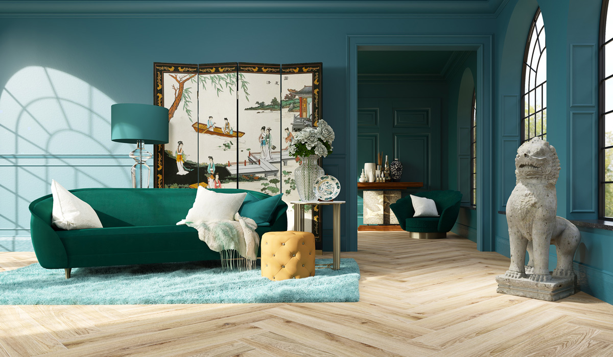
Apply the 60-30-10 Rule
The 60-30-10 rule is a widely used design principle for balanced color distribution.
- 60% of the room should be the dominant color (usually walls).
- 30% should be a secondary color (furniture or curtains).
- 10% should be an accent color (accessories, cushions, artwork).
This formula ensures visual balance and prevents any single color from overpowering the space.
Consider Natural and Artificial Lighting
Lighting significantly impacts how colors appear. A shade that looks perfect in the store may look different at home.
- Rooms with abundant natural light can handle darker or cooler tones.
- Low-light spaces benefit from warm and lighter shades.
- LED lighting may slightly alter color temperature.
Always test paint samples on walls and observe them at different times of the day before making a final decision.
Create Flow Between Rooms
Consistency is key to a luxurious interior. Even if each room has a unique personality, there should be a sense of connection throughout the house.
Choose a core color palette and vary shades slightly from room to room. For example, if your living room features warm beige tones, bedrooms can use softer variations of the same undertone.
This continuity creates harmony and enhances overall visual appeal.
Use Accent Colors Strategically
Accent colors add personality and depth to a space. They should complement—not compete with—the dominant tones.
Popular accent choices include:
- Deep navy
- Emerald green
- Burnt orange
- Mustard yellow
- Matte black
Use accents in smaller elements such as throw pillows, rugs, art pieces, or decorative objects. This approach allows flexibility if trends change.
Balance Warm and Cool Tones
A common mistake in interior design is mixing clashing undertones. Warm tones (yellow, red, orange undertones) and cool tones (blue, gray undertones) should be balanced carefully.
If your walls have warm beige undertones, choose furniture and décor that align with that warmth. Mixing cool gray furniture with warm cream walls may create visual tension.
Harmony between undertones ensures a polished and intentional look.
Consider the Room Size
Color can visually alter the perception of space.
- Light colors make small rooms feel larger.
- Dark colors create intimacy in large rooms.
- Vertical color blocking can make ceilings appear higher.
- Horizontal accents can widen narrow spaces.
Strategic color placement enhances both comfort and functionality.
Incorporate Texture Alongside Color
Color alone does not create depth—texture plays an important role as well. Soft fabrics, wooden surfaces, metallic finishes, and matte elements add dimension to your chosen palette.
For example, a neutral gray room can feel luxurious when paired with velvet cushions, brushed metal lamps, and textured rugs.
Texture enhances color without requiring bold contrasts.
Stay Timeless Rather Than Trend-Driven
While trends can be inspiring, interior color palettes should have long-term appeal. Bold trend colors may lose popularity quickly.
Instead of painting entire walls in trendy shades, incorporate fashionable colors through décor items that are easy to replace.
Timeless palettes maintain elegance and protect your investment.
Conclusion
Choosing the perfect color palette for home interiors requires understanding color psychology, lighting conditions, room size, and balance principles. By starting with a neutral base, applying the 60-30-10 rule, and maintaining undertone harmony, you can create a cohesive and luxurious living environment.
A well-planned color scheme enhances mood, improves visual flow, and transforms a house into a sophisticated and comfortable home.


